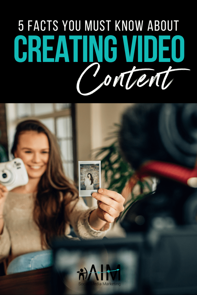
Do you make graphics or videos for your social media content?
Here are some things you should know…
Video Length:
Facebook videos should be anywhere from 1 minute to 5 minutes. Shorter performs better and gets more engagement because consumers like snappy videos. Too much longer and you will lose their attention.
YouTube videos that are approximately 2 minutes long perform best. That being said – experience with different lengths as you grow your subscribers. People are more likely to watch longer videos once they know you produce good, high-value content.
Good Performing Video:
The best videos are the ones that are bright, have a clean and bright background with a catchy beginning. If you can draw them in at the beginning, you’ll hold their attention longer.
Overproduced content doesn’t always perform better. Video shot with your iPhone can perform just as well (if not better) than the videos recorded with the most expensive equipment. It’s more about the content and value you offer than the production quality.
That being said, videos that are blurry or too dark won’t perform as well so make sure you have a well-lit environment.
Text in Video:
Some videos have text in it. Not a bad idea – especially if you’re using it to highlight the main points of your video. When using text, make sure it stays on the screen long enough for slower readers to read it. Keep text minimal so your video doesn’t become cluttered or confusing.
Video vs Graphics:
Should you use videos or pictures? There’s a benefit to doing one over the other. Videos move, so they’re more likely to catch the attention of your audience. The right photo or image though can do the same. If you can create a catchy video, then go for the video!
Creating Good Graphics:
The best graphics use bright colours. The colours red, orange and yellow perform best for catching attention. When creating graphics, it’s important to look at the different colours you’re using to ensure they’re high contrast, complement each other AND are easy to read when text is involved.
Don’t use more than 3 different fonts or text colours. Anything more than that looks unprofessional, cluttered, and loses its esthetic.
When including words on your graphics (or videos) it’s a great practice to only include up to the amount of text that equals 25% of the image. Anything more than that is usually too much text. If you want to include more text, put it in the body of the social media caption instead.
Need help creating content? We have the ultimate content bundle that will help you come up with content ideas and make creating content so much easier.